# Import the necessary modules and libraries
import numpy as np
from sklearn.tree import DecisionTreeRegressor
import matplotlib.pyplot as plt
필요한 모듈을 가져옵니다.
DecisionTreeRegressor
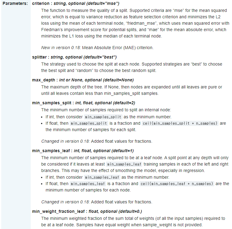
DecisionTreeRegressor에 대한 설명은 위와 같습니다.
주로 max_depth 즉, 트리 깊이를 제한하여 과대 적합을 막습니다.
또 다른 방법으로 max_leaf_nodes 또는 min_samples_leaf 중 하나만 지정해도 과대 적합을 막을 수 있습니다.
# Create a random dataset
rng = np.random.RandomState(1)
X = np.sort(5 * rng.rand(80, 1), axis=0)
y = np.sin(X).ravel()
y[::5] += 3 * (0.5 - rng.rand(16))
랜덤 데이터셋을 만들겠습니다.
rng = np.random.RandomState(1)
np.random.RandomState로 확률분포에서 나올 수 있는 값들을 임의로 생성하고 Random seed를 1로 설정했습니다.
X = np.sort(5 * rng.rand(80, 1), axis=0)
X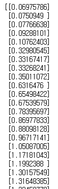
rng.rand(80 , 1)로 80 X 1 행렬을 만들어 준 후 연산을 해주고 np.sort로 오름차순으로 정렬합니다.
y = np.sin(X).ravel()
y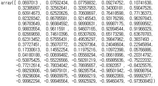
np.sin(X)로 X 값들에 sin함수를 취해준 후 ravel()을 통해 다차원 배열을 1차원 배열로 평평하게 펴주었습니다.
y[::5] += 3 * (0.5 - rng.rand(16))
y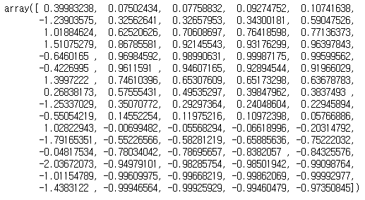
0, 6, 11...번째 값에 새로운 연산을 취해주었습니다.
# Fit regression model
regr_1 = DecisionTreeRegressor(max_depth=2)
regr_2 = DecisionTreeRegressor(max_depth=5)
regr_1.fit(X, y)
regr_2.fit(X, y)
DecisionTreeRegressor을 만들었습니다.
regr_1은 max_depth=2로 regr_2는 max_depth=5로 지정한 뒤 X, y데이터에 적합시켰습니다.
# Predict
X_test = np.arange(0.0, 5.0, 0.01)[:, np.newaxis]
y_1 = regr_1.predict(X_test)
y_2 = regr_2.predict(X_test)
이제 예측을 하겠습니다.
X_test = np.arange(0.0, 5.0, 0.01)[:, np.newaxis]
X_test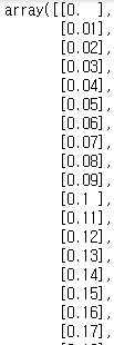
np.arange를 통해 0.0부터 5.0까지 0.01 간격으로 배열을 만들었습니다.
np.newaxis로 차원을 추가하여 500 X 1 행렬을 만들었습니다.
y_1 = regr_1.predict(X_test)
y_2 = regr_2.predict(X_test)
위에서 만든 새로운 데이터를 가지고 두 모델을 이용하여 각각 예측합니다.
# Plot the results
plt.figure()
plt.scatter(X, y, s=20, edgecolor="black",
            c="darkorange", label="data")
plt.plot(X_test, y_1, color="cornflowerblue",
         label="max_depth=2", linewidth=2)
plt.plot(X_test, y_2, color="yellowgreen", label="max_depth=5", linewidth=2)
plt.xlabel("data")
plt.ylabel("target")
plt.title("Decision Tree Regression")
plt.legend()
plt.show()
그래프로 나타냅니다.
# Plot the results
plt.figure()
plt.figure()로 새로운 figure를 만듭니다.
plt.scatter(X, y, s=20, edgecolor="black",
            c="darkorange", label="data")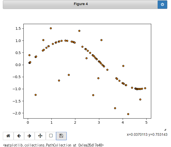
plt.scatter로 산점도를 만듭니다.
X, y 데이터를 이용하고 사이즈는 20, 원 테두리 색깔은 검정, 원 색깔은 어두운 주황색, label은 data로 설정했습니다.
plt.plot(X_test, y_1, color="cornflowerblue",
         label="max_depth=2", linewidth=2)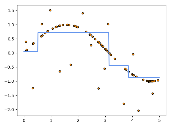
plt.plot로 line 그래프를 그립니다.
X_test, y_1 데이터를 이용하였고, 선 색깔은 cornflowerblue를, 두께는 2로 해준 후 label은 max_dapth=2로 했습니다.
plt.plot(X_test, y_2, color="yellowgreen", label="max_depth=5", linewidth=2)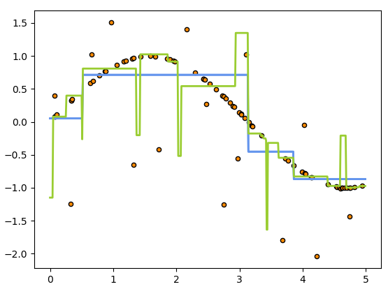
두 번째 예측 모델 그래프를 추가했습니다.
X_test, y_2 데이터를 이용했고 색은 yellowgreen을 두께는 2로, label은 max_depth=5로 설정했습니다.
plt.xlabel("data")
plt.ylabel("target")
plt.title("Decision Tree Regression")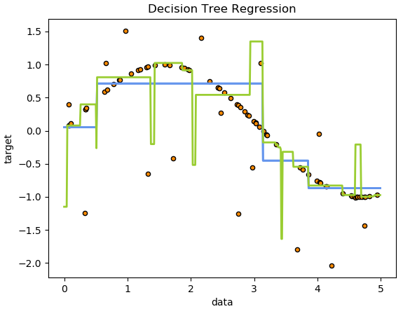
x축, y축, 제목을 붙여줍니다.
plt.legend()
plt.show()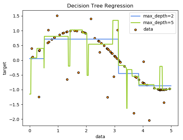
마지막으로 범례를 추가하면 최종 그래프가 완성됩니다.
코드 원문 링크를 첨부합니다.
Decision Tree Regression — scikit-learn 0.21.3 documentation
Note Click here to download the full example code Decision Tree Regression A 1D regression with decision tree. The decision trees is used to fit a sine curve with addition noisy observation. As a result, it learns local linear regressions approximating the
scikit-learn.org
'scikit-learn' 카테고리의 다른 글
| Scikit-Learn(사이킷런) 코드 완벽 분석 - Linear Regression csv 파일 이용하기 (0) | 2019.10.24 |
|---|---|
| Scikit-Learn(사이킷런) 코드 완벽 분석 - Linear Regression OLS, Ridge Variance 비교 (0) | 2019.10.21 |
| Scikit-Learn(사이킷런) 코드 완벽 분석 - Linear Regression Lasso (0) | 2019.10.18 |
| Scikit-Learn(사이킷런) 코드 완벽 분석 - Linear Regression Ridge (0) | 2019.10.16 |
| Scikit-Learn(사이킷런) 코드 완벽 분석 - Linear Regression 내장 데이터셋 (0) | 2019.10.16 |


댓글